How design helps us live better
Creating an environment for better living through people-first design
Have you ever walked into a room and felt your mood shift? Maybe you woke up grumpy, but after stepping into an open, sunlit Pilates studio things didn’t seem that bad. Or perhaps you sat down at a restaurant and the luxurious velvet seats and dimmed lights encouraged you to treat yourself to dessert (which you’d normally skip).
The way these spaces affect our mood is often subconscious – we don’t even realise it’s happening – which is exactly what makes them well designed. “If a space features really good design, most people won’t even notice it’s there,” explains Peter Panetta, design director for Home, who’s well-versed in creating affective spaces through design.
Working with our country’s leading and award-winning architectural firms like Bates Smart – who designed Home Southbank – our design team worked to ensure every element of Home was considered to help people lead a better life.
“We wanted to create a space that felt thoughtful – a place that is homely at its core,” explains Tamara Bird, Home’s design manager. Sure, that means ticking some essential functional boxes (kitchens need ovens, bathrooms need showers, etc.) but it also means pushing the boundaries of contemporary design by adding things that raise the bar for how people live (for example, a bookable private dining room 59 stories in the sky with add-ons like a private chef).
Creating inclusive spaces
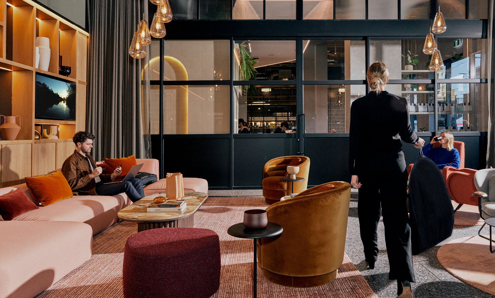
When it came to designing Home, we scrutinised every detail to ensure it always centred on the resident and showed them the potential for a better life. As Panetta explains, “It’s designed to be inclusive – something you can walk in and want to spend time in. But we also want to align with people’s aspirations of their identity. We want them to say, ‘I’m really proud of being here and I love being in this space.’”
Modern Australian luxury
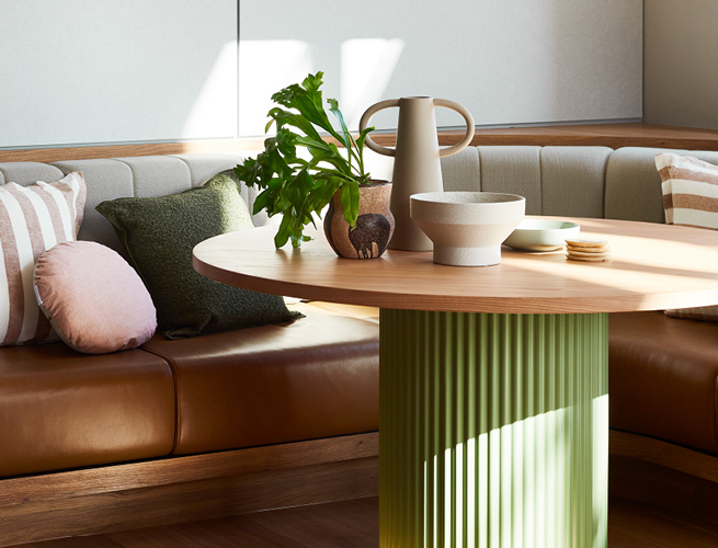
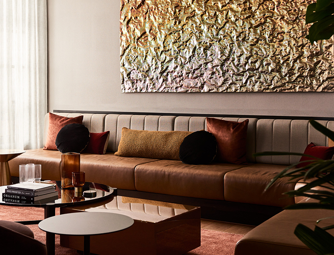
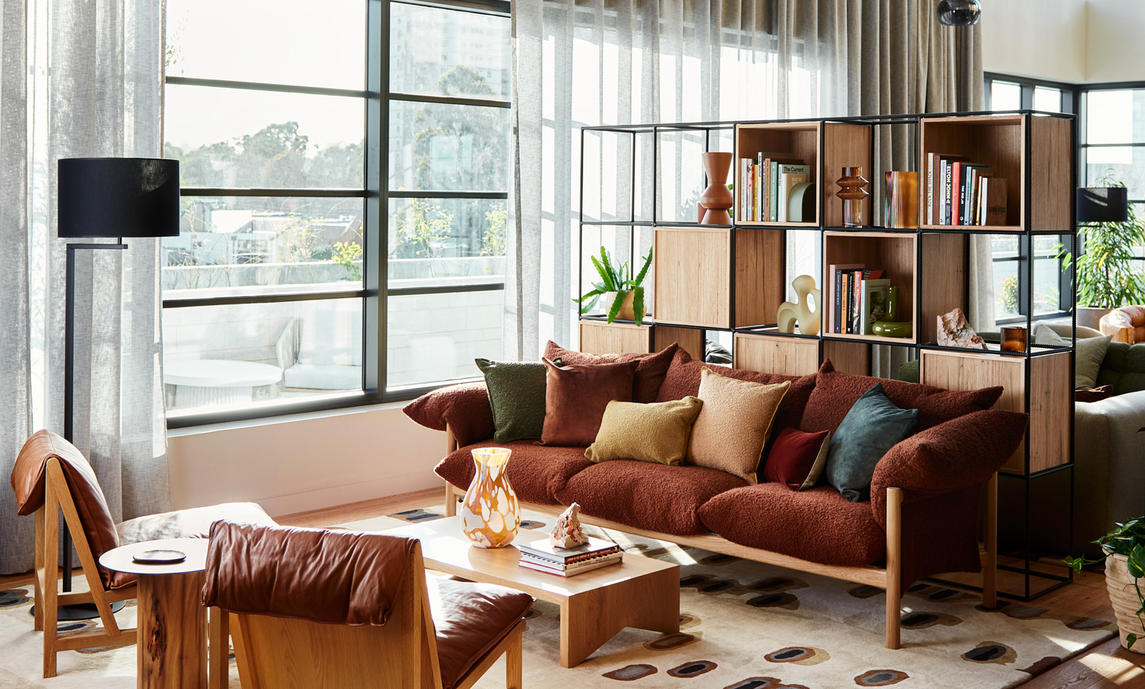
To create that sense of pride, we focus our design aesthetic on the idea of modern Australian luxury and use materials that embody it – like solid timbers and natural stone.
“Modern Australian luxury is self-assured without trying too hard,” explains Bird. “It’s quality, it’s robust, it’s sustainable. It should embrace the use of honest materials. And it should embrace the Australian way of life. Spaces should feel really inviting and never alienating or intimidating.”
We tapped a collection of talented local designers and makers to help bring this vision to life, from established names like Jardan to more emerging suppliers like Melbourne-based craftsman Hugh McCarthy. “It’s so nice being able to work with these makers to customise things to suit our space. They understand the needs of our market better than anyone,” explains Bird.
Respecting neighbourhoods
Engaging local artists, designers and makers is just one of the ways that we’re connecting our design philosophy with contemporary Australian living – a throughline that extends to exterior design too.
To ensure that Home residences thoughtfully engage with their broader context, our design team drew on each location’s neighbourhood – not just for inspiration but also to pay respect to the history of their surroundings.
“Home Richmond has sawtooth roofs as a nod to all the sawtooth industrial heritage buildings found locally. While at Home Southbank we’ve used the materials, textures and colours from its surroundings, like the steel structure of the Kings Way overpass or recycled bricks representing nearby warehouses. And then there’s Home Docklands, which will feel like a sanctuary, since it’s got great access to the boulevard along the water but you’re so close to the city,” says Panetta.
While the look and feel of each residence is tailored to its specific location, there’s a consistent warmth and accessibility at their core thanks to the overarching design philosophy. It means that no matter your location, it always feels like Home.
Designing for the long haul
The consistency of our approach is perhaps best showcased in the way we centre communal facilities in each location. By designing with the experience of residents as our number one priority, amenities such as shared spaces and wellness quarters are placed in prime spots.
“We take the best parts of a site and we give it back to the residents,” explains Panetta. “Think about that in the context of Home Southbank – a tall, 60-storey tower where the best part of the building is the view. Instead of building a penthouse where only one person can enjoy it, we’ve taken the top of that building and decided it’s the best place for our communal amenity.”
It’s a reminder of just how focused on improving people’s lives we are at Home. “The one thing we always come back to when we’re designing is the resident,” says Panetta. “They’re our primary focus in everything that we decide. Because we’re in it with them – for the long haul.”
Book a tour now to explore Home’s considered approach to design.
